
Distance Design Project Reveal: Modern Mountain Colorado Retreat {Part 01}
- Oct 23, 2025
- 5 min read
Updated: Jan 28

Point of View: One of our repeat clients reached out to let us know that she and her husband had purchased another property in Colorado, and were wondering if I was available to help with interior updates! I saw the photo above and immediately said yes - I mean, seriously? THAT view had me at hello! Breathtakingly gorgeous and quiet - the perfect getaway!
This property was meant to be a second home for my client's family, but they were also considering whether to list the property for large party vacation rentals when they weren't using it themselves. They were interested in whether we could do improvements sans construction that would entice a potential vacation renter, and update the look of the interior for their family and within reason. They plan on investing in major updates in a few years when they'll be able to spend more time there. Because of all of these factors, not to mention travel logistics and family life with kids still in school, we agreed that we would move through the design process under our Distance Design Service where NLI provides a professional design plan to the client who then handles project management including procurement and delivery and installation.
Today we're exploring the before and after, complete with design concepts and options for the entry, kitchen, and main living and dining area! Not every design suggestion was taken, but the final result is lightyears above where we started as you can see from the before and after photos.
Scroll through to explore this beautiful modern mountain cabin that sleeps TEN!
Distance Design Project Reveal: Modern Mountain Colorado Retreat
Wow, what an entry, right? You get a little taste of the wood trim you find all over the house in this entry, and the large scale organic stone tile floor. The client initially wanted to paint over all of the trim, and while I might normally agree with her, this house is calling for that trim to stay intact...it really depends on the rest of the hard finishes in a home as to what the right way to go is. We kept the warm wood trim and transformed the entry and main floor walls throughout using the same warm white color.

and the before....

We suggested a dark olive paint color for the entry to give it some pizazz, but the clients ended up using the same warmer white color as the main living space (Benjamin Moore
OC-5 Maritime White).
They switched to a more modern, textured entry rug, perfect for wet winter boots, added a small stool in the corner to take off said boots, and hung a round mirror above the existing console to give this area a bit more functionality. Styling items will be added later but for now less is more. Not bad for the first salvo.
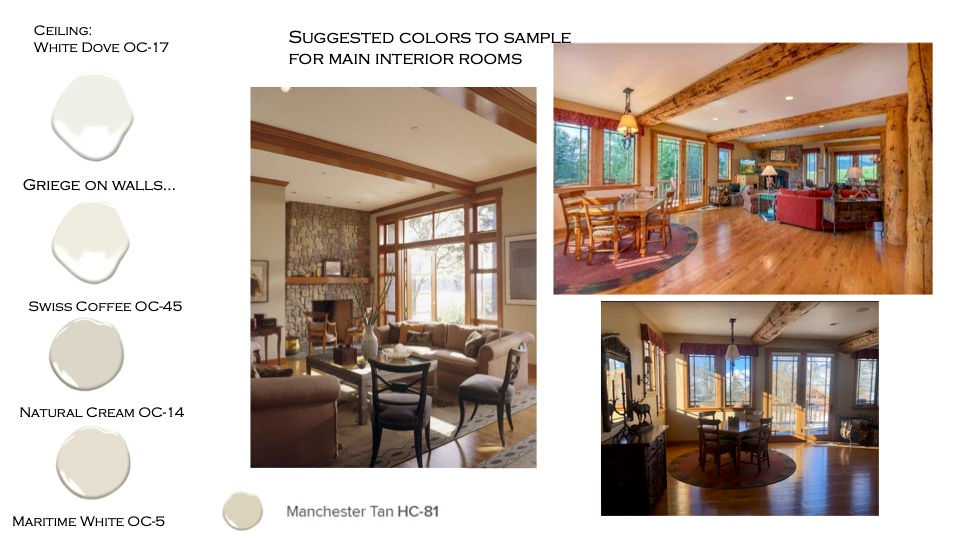
The client originally mentioned using a specific paint color to paint all of the walls but I gently let her know that the color she had in mind was a true white, and that the warmth of the beams and trim necessitated a warmer white instead. Since I couldn't be there in person, I gave a couple of options for their painter to sample first and offered video calls/photos of these colors sampled against her stone flooring and fireplace to make sure they chose the right shade for their space (scroll down to see the after photos below).

Anybody else humming Christmas carols right now looking at the before photos above? Just me? I doubt it. The previous owners were apparently fans of green and dark red for paint and furniture - and well, let's just say I'm not a fan of that color combination except for the brief weeks leading up to December 25, ha. I really wanted to find a way to incorporate warmer toned greens and deeper brown leathers and wood tones into the space to really pull from the environment outside.
Here's the initial concepts design board we created for the living room area...


We wanted to provide different statement chair options, both in color and neutral cream, to pair with whatever paint colors became final for this area. The photo below gives a sneak peek to the new updated lighting as well as furniture.

Ahhh, I think I heard you breathe a collective sigh of relief with all the changes that have made thus far. Ample seating, with performance fabric (all my rental owners know this is crucial), and moveable side tables to fit all types of scenarios. I love this rug because it pulls in all the colors from the room as well as outdoors, and the richness of the woods.
The budget was very critical to this project, so the furniture is good quality, but not what I would consider heirloom quality. With this being in the rental pool for the next five years or so, these pieces should serve the house nicely for that amount of time. We did reuse some of the old furniture that came with the house in other places in the house (stay tuned for Part 02!) and that in itself helped us stay on target within the client's stated budget.

You can really see the details that make it a true mountain house, now that the furniture is more modern, quiet, and scaled correctly for the space!

As more selections became finalized, and the black appliances started to stand out, it made much more sense to paint the island a deep black color, as well as the built in bookcase to the right. There is a good bit of black in the granite of the countertop also, so that choice worked just perfectly.

I love the industrial feel of the new light fixture above the island - it really ties in the black elements well, and gets rid of the dated swoosh-a-licious ironwork in the previous chandelier. We selected this particular new fixture because of the wood + black metal detail, plus it met all the other important criteria - the price was right, the style worked with the house and the coloring was great!
Same goes for the new barstools - the metal legs give them a bit of an industrial vibe, and the brown leather seats are comfortable, cleanable, and just modern enough to update the space!

The red tile band in the backsplash is being kept for now, but it definitely doesn't stand out as much as it did before. They do want to completely gut the kitchen, but the plan is to have this property up for rental for about five years before they are ready to move out there full time.

We continued the same black industrial look into the big dining area with the chandelier and black wood chairs. An expandable table would fit perfectly, and give the space so much more flexibility, especially for a large party rental.
Let's revisit with a before photo really quick...
and a great after photo of the overall finished space from my client...

and in the daytime...
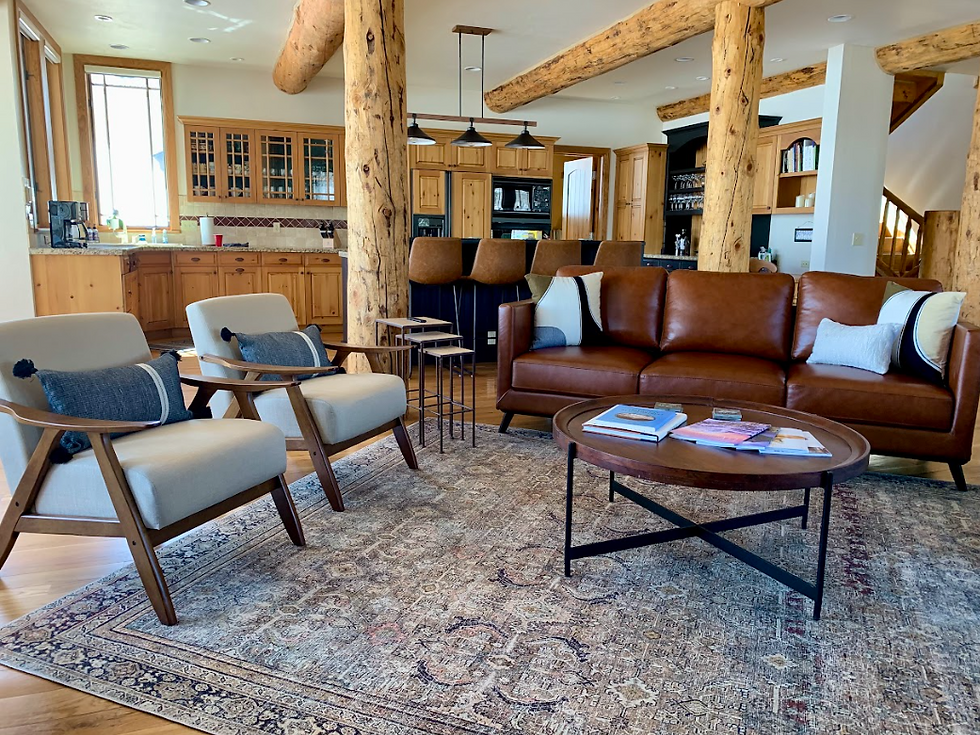
What I love the most is how much seating we packed into the space without overwhelming it! If you're counting along, we have 8 dining chairs, 4 barstools, 4 lounge chairs and a 3 seater sofa, and four game table chairs in this space. Perfect for a big family reunion or a large friends trip!

Come on y'all, I just can't with this view! This is by far my favorite shot from the new space. Stay tuned later in the month for the rest of the transformations of the bedrooms, lounge areas, and bathrooms! If you're interested in renting this beautiful property for a trip, reach out and let me know - I can get you connected :)

Need help with your own distance design project and want to learn more about working together? Submit an inquiry through our contact page here. We’d love to see if we’d be a good fit for your project!


